We’ve all been there; you Google a topic, click the link and land on the page. If your first impressions are good, you’ll stay there, scroll a bit and maybe even click an internal link; but if your impressions are bad, you’ll bounce in less than a second. Having a reader-friendly layout is crucial to keeping a low bounce rate.
The power of first impressions
Your blog layout is like a first date — it sets the tone for everything that follows. Even the best-written post might lose its shine if the design is clunky or chaotic. People are visual creatures. When readers land on your page, they instantly form an opinion based on what they see. A well-structured, clean layout makes a post feel more approachable, while a messy, cramped page can overwhelm or confuse. You want to invite your readers in, not make them feel like they’ve just walked into a cluttered room.
So, what’s the trick? It’s all about balancing text with white space. White space gives the eyes room to breathe, making your post feel lighter and easier to digest. Think of it as adding pauses in a conversation; it lets things sink in. On the flip side, blocks of text can feel like you’re talking too fast without a break — exhausting, right?
Headings: Your roadmap
Imagine reading a book without chapter titles or section breaks. You’d be lost pretty quickly. Headings in a blog post serve the same purpose. They act as signposts that guide readers (and search engines) through your content and let them know what’s coming next. From a psychological standpoint, breaking your content into chunks with clear headings gives the brain a chance to process one idea before moving on to the next.
And let’s be honest, in the fast-paced world of the internet, most readers are skimming. Headings allow them to quickly scan your post and decide if they want to dive deeper into specific sections. A good rule of thumb is to have a heading every 200-300 words to keep things moving and avoid overwhelming your audience.
The magic of bullet points and numbered lists
Raise your hand if you’ve ever skipped to a list in a blog post because it felt easier to read. You’re not alone. Lists are like the fast food of blog content — quick, easy and satisfying. They break down information into bite-sized pieces that are easy to scan, making complex ideas feel more manageable. Plus, they create a visual break from paragraphs, making your post feel more dynamic and less monotonous.
Psychologically, lists cater to our need for structure. They give the brain a sense of completion with each item, which can be oddly satisfying. Whether you’re using bullet points or numbered lists, these formats create an appealing and effective sense of order for quickly delivering information.
Fonts and readability: Don’t overdo it
Fonts are like the tone of your voice in writing. They can be fun, serious, professional or playful. But here’s the thing: Readability trumps creativity when it comes to blog posts. Sure, that curly, whimsical font might look cute, but if readers have to squint or slow down to understand it, you’re already losing them.
Stick to fonts that are easy to read, especially for body text. Standard fonts like Arial, Georgia or Times New Roman are reader-friendly choices. You can play around with headings if you want something unique, but always prioritize clarity over flair.
Font size matters, too. Don’t make readers work hard to read your content. Aim for at least 16 pixels for body text and don’t be afraid to go larger for headings. And spacing? It’s crucial. Adequate line spacing between sentences and paragraphs gives your text room to breathe, reducing the visual strain on readers’ eyes.
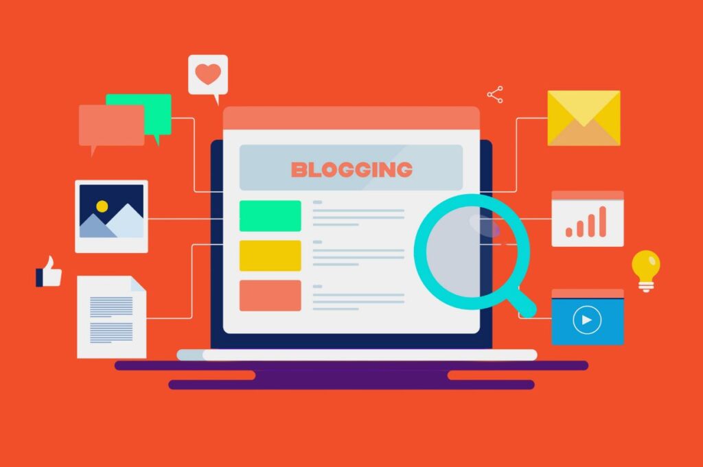
The role of images and visuals
Humans process images much faster than text — 60,000 times faster, to be exact. So, adding relevant images, infographics or charts can enhance your content’s message and make it more engaging. But there’s a caveat: don’t overdo it. Too many visuals can clutter your layout, making it hard for readers to focus on the actual content.
From a psychological perspective, images stimulate the brain differently than text. They activate the brain’s visual centers and make your post more memorable. Plus, a well-placed image can provide a break between sections, much like white space. It allows readers to process what they’ve just read before reading the next part of your post.
Paragraph length: Keep it short and sweet
Here’s a quick tip: break up your paragraphs. Long blocks of text can be intimidating. The last thing you want is for your readers to feel like they’re about to tackle a novel. Aim for paragraphs that are two to four sentences long. It keeps the pacing snappy and makes your content more inviting.
Short paragraphs are easier on the eyes and help maintain attention, especially on mobile devices, where longer paragraphs can feel endless. In the digital world, less is more. Keeping things concise respects your readers’ time and helps them stay engaged.
Call to action: Keep it clear and compelling
The end of your blog post is prime real estate for a call to action (CTA). Whether you want your readers to subscribe, share or check out another post, the key is to make your CTA clear and compelling. Psychologically, people are more likely to act when the next step is obvious. A simple, well-placed CTA can guide readers toward the action you want them to take without feeling pushy.
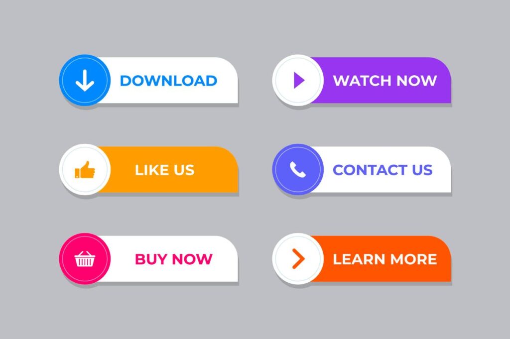
Avoid cluttering your CTAs with too many choices. The paradox of choice tells us that people are less likely to decide if they are presented with many options. Stick to one or two strong calls to action that align with your goals, and you’ll see better results.
The psychology of color and contrast
Color has a huge psychological impact on how people perceive your blog. Warm colors like red, orange and yellow can create a sense of urgency or excitement, while cool colors like blue and green tend to be calming. But it’s not just about the color itself — contrast is key. High contrast between your text and background improves readability, which keeps readers on your page longer.
For example, black text on a white background is a classic combo because it’s easy to read. If you want to incorporate color into your blog, do so thoughtfully — use it to highlight important points, buttons or links, but avoid going overboard with bright, clashing hues that strain the eyes.
Final words
Formatting isn’t just about making your blog post look good — it’s about creating an easy and enjoyable experience for your readers. By paying attention to layout elements like white space, headings, fonts and visuals, you’re not just organizing content — you’re tapping into psychological cues that keep people engaged. So, next time you’re crafting a blog post, remember: A reader-friendly layout goes a long way in building a loyal audience.
Mandy is a co-founder of Brilliant Bloggers and Food Drink Life, as well as the creator behind Splash of Taste and seven other high-profile blogs. Her work has been featured in major outlets, including NBC, Daily News, Boston Herald, Chicago Sun-Times, Odessa American, The Voice and Orlando Sentinel. Apart from being an enthusiastic cook, she is a passionate traveler who has a mission to explore as many countries around the world as she can. She is forward-thinking and always has her eyes open to spot the next big trend and opportunity.